Bay Area Anti-Trafficking Coalition (BAATC)
Project Spotlight: Bay Area Anti-Trafficking Coalition "Rise Up" logo design
Challenge:
The Bay Area Anti-Trafficking Coalition approached us with a vision to revamp their logo. Their goal was to capture the spirit of empowerment, community, and activism against human trafficking, emphasizing rekindling involvement in the movement.
Approach:
We dove into understanding the core values the coalition wanted to express: igniting activism, fostering a sense of community, and inspiring people to rejoin the fight against human trafficking. The idea was to create a logo that resonates with their audience and stands as a beacon of hope and action.
Color Palette:
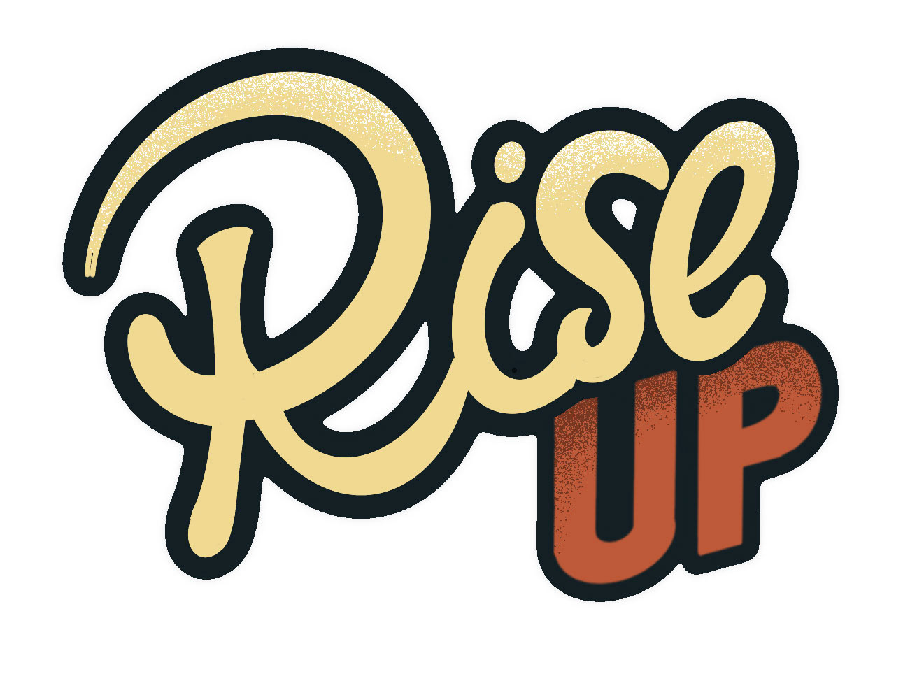
Steering away from their existing blue and green logo, we chose colors that would complement yet distinctly stand out. The flexibility of multiple color variations ensured versatility for different applications, including overlay options for photos and images.
Design Concept:
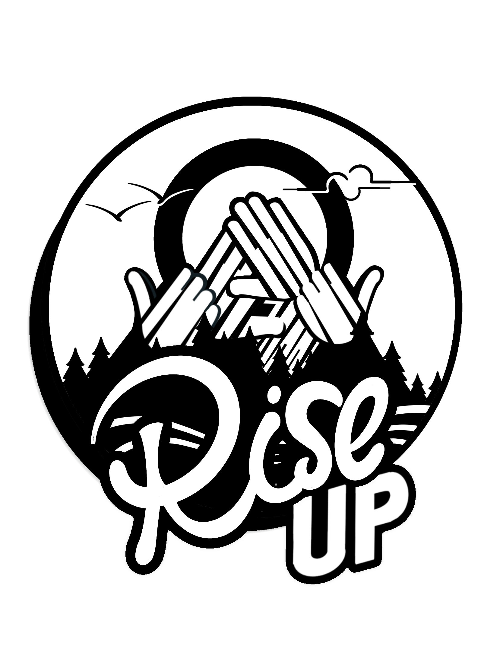
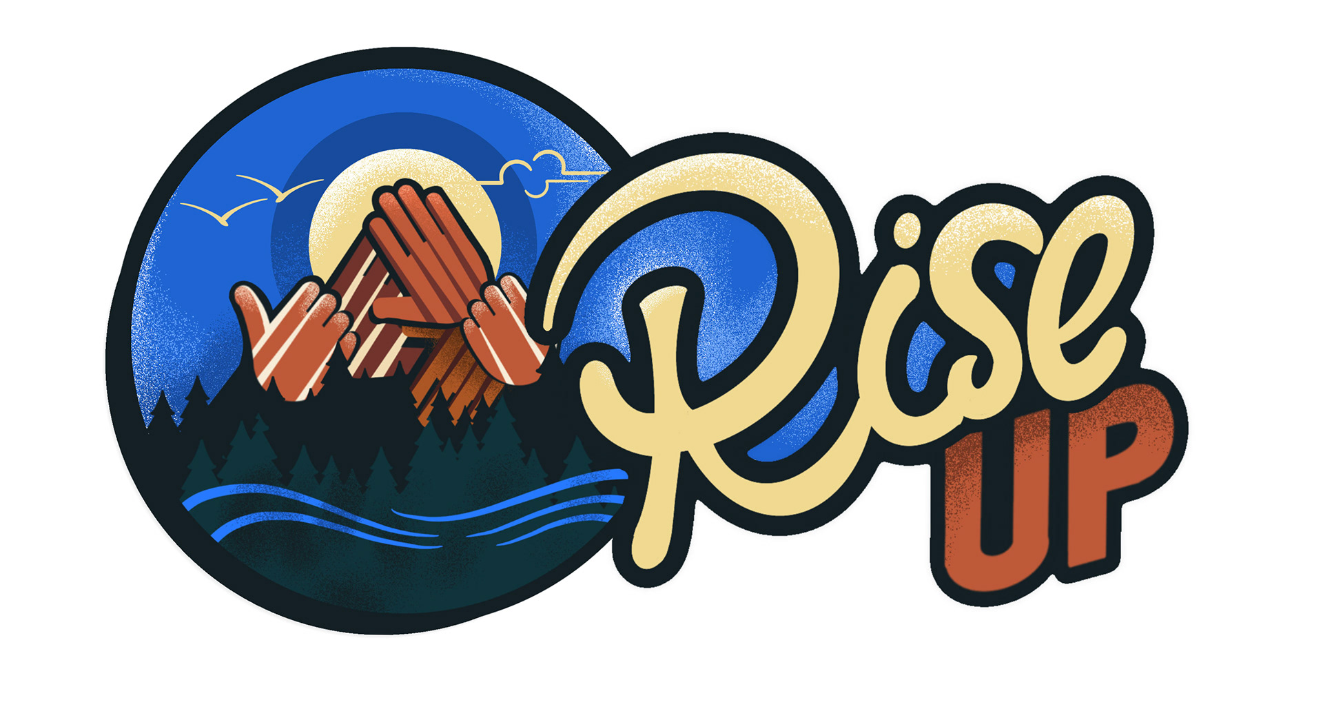
Inspired by the idea of 'Rising Up' as a metaphor for awakening and unity, the design mimics a sunrise ascending behind mountains. This symbolizes the collective emergence from the isolation of the pandemic and a renewed commitment to the cause. The design choice reflects a modern yet classic aesthetic, moving away from the corporate feel of their previous logo.
Typography and Imagery:
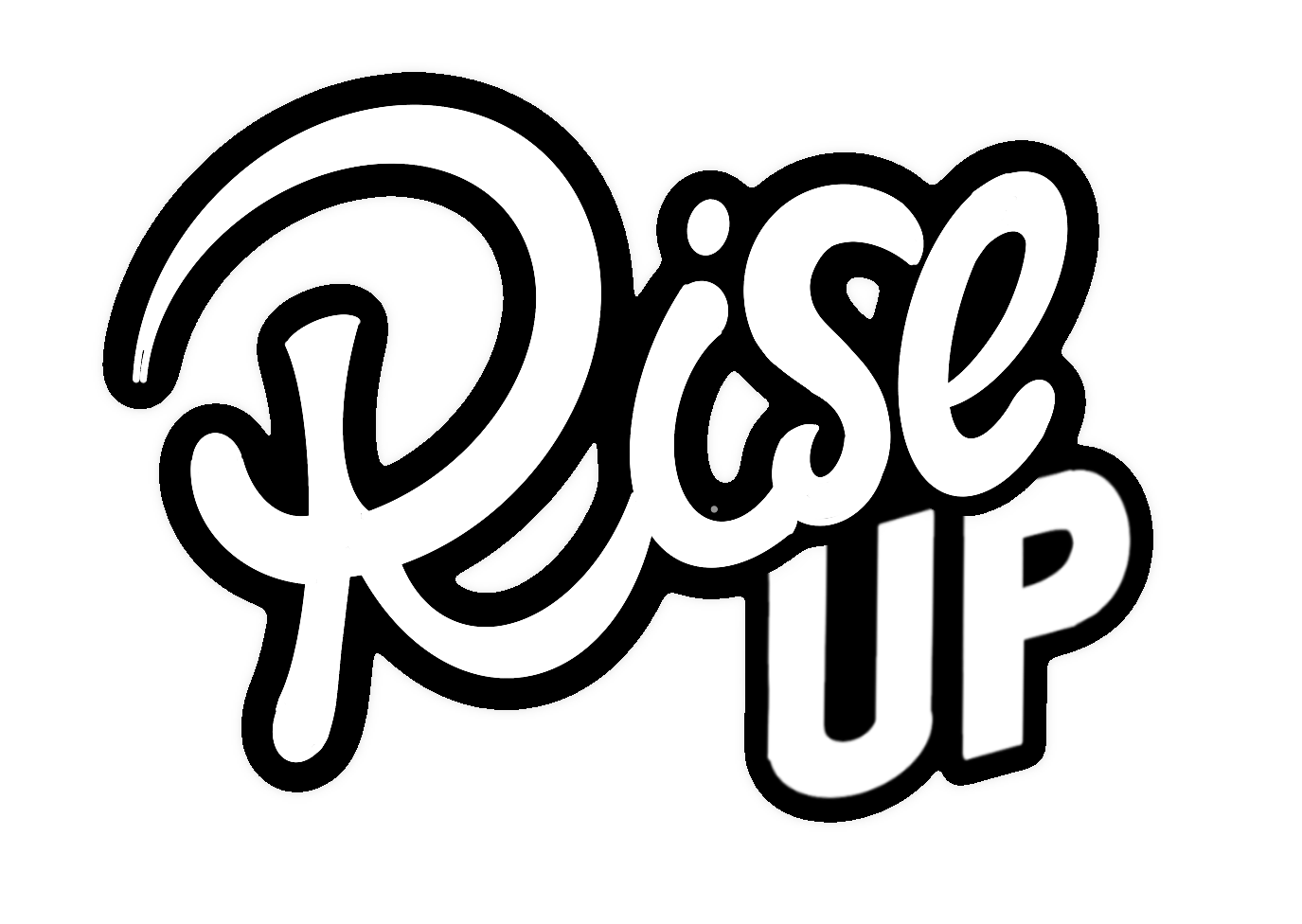
We developed an artistic hand-lettered option, creating a dynamic movement in the words "Rise Up". This conveys the message and adds an emotional and personal touch, aligning with the desire for a more approachable, less masculine style. It was important that the text could be used as a single element, a task we were able to accomplish.
Audience Engagement:
Recognizing the diverse demographic of their audience, from younger Instagram users to the more established Facebook and email groups, the logo was crafted to appeal across generations, inviting participation and evoking a sense of belonging.
Branding Evolution:
With the coalition's shift from a regional to a national focus, we ensured the new logo transcends geographical boundaries, avoiding specific Bay Area landmarks or symbols.
Functionality:
The design's versatility allows for seamless application across various mediums - the website, social media, or printed materials for events, particularly their important January gathering.
Outcome:
The final logo is more than a symbol; it's a call to action. It invites everyone to "Rise Up" and be part of a movement, embodying the notion that everyone has a significant role in the fight against human trafficking.
Another set of logos
